Whether you’re a website owner or a marketer, if you’ve been
around for a while, by now you’d be familiar with the importance of
WordPress website usability. If not, it’s time to upgrade your
knowledge for good.
Most of the times, people develop a website, optimize and tweak it
a bit, perform certain activities, and start feeling contented with
steady traffic flow. However, their contentment soon takes the form
of anxiety when they don’t receive an adequate number of
conversions.
If you’ve been in the same boat, you might realize how it feels
getting enough traffic but not being able to convert it into happy
customers, isn’t it? To tell you the truth, one of the most
important factors that result in low conversion rate is the usability
of the website.
Usability is the key that helps visitors roam around the website
and determine the level of ease and comfort while navigating through
every available element or page. For a modern user, factors like slow
loading, ancient layouts, and more are major roadblocks that stop
them from having an amazing experience. That’s probably one of the
significant reasons why they ditch the website and never come back.
Since your WordPress website should be capable of leaving a positive impression, it has to be strong enough when it comes to user experience. So, how can you enhance the usability of your site? Here are some of the best ways to help you out.
Clean & Tidy Design
A majority of users concentrate mainly upon pretty designs rather
than the functional ones. To tell you the fact, it’s a myth
prevalent all across the industry that the audience chooses
appearance over the comfort of use. In reality, visitors prefer
functionality over striking appearance.
Therefore, while pondering upon many factors, don’t end up
developing such a website that does nothing but confuse your
visitors. Your website should not complicate navigational aspect for
your users. While intriguing and unique designs may win you creative
appreciation; on the other hand, if you are using predictable
interface it may help you gain conversion.
For instance, have a look at this website here:
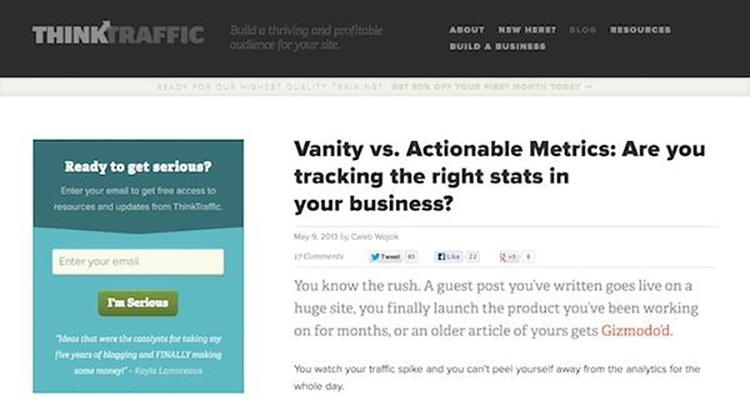
Ref. site:
https://www.wpexplorer.com/wp-content/uploads/think-traffic.jpg
What is the best part that you can notice in this picture? The
combination of beautiful typography, full-width design, and bold
colors look simple and clean, isn’t it? Not just that, it even
represents an amazing balance between functionality and formation.
Keeping this in mind, you can strive for a similar appeal and make
the website usability a primary aspect to attract more and more
visitors.
Remove Broken Links
Broken links are the ones that redirect your visitors to such
pages that don’t exist. For instance, suppose that you published a
valuable article on your blog and added an external link to a
relevant blog published on an authoritative website.
After a few months, if the owner of the external website has
deleted that specific blog, link mentioned on your website will be
futile and dead. So, if somebody clicks on that link to obtain more
information, he/she will find nothing. And, it can be a major
turn-off for your readers. Hence, it’s important to remove such
links from the site as they can leave a bad impression on your
visitors.
Of course, assessing every available link on the site manually becomes a hectic job. In such a scenario, you can seek help from adequate premium WordPress plugins and can keep a tab over your links from time-to-time.
Simple Website Navigation
Often, you’d have come across such websites that make use of
mega menus. Of course, these massive menus attract a majority of
website owners. However, even if you think of walking on the same
path, what you must keep in mind is the correct implementation.
With mega menus, surely, you can organize a variety of pages,
sub-pages, as well as featured content into small spaces. But, going
overboard with them is also easier, which can have its own
repercussions. With a variety of plugins, you may end up adding
images, widgets, and a lot more into your mega menu, which can be
distracting to your users.
The way Amazon has done it is quite simple-
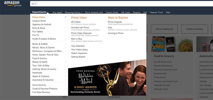
Ref. site:
https://speckyboy.com/wp-content/uploads/2018/09/content-heavy.usability.jpg
If you’re planning to implement mega menus, consider the primary
purpose. You must make the content easy to find and the menu should
be easy-to-read. Avoid overstuffing as it can impact the legibility
altogether.
Use Contact Forms & Popups Carefully
To enhance the subscribers’ base and to engage the audience, popups and contact forms are widely being used across the globe. However, one thing that you must keep in mind is that the excessive use of these two elements can impact the usability of your website altogether.
Not just that, but if you’re displaying a large number of forms
and popups, you can come on Google’s radar, which can result in low
SERP. Thus, it would be better for you to be cautious and keep the
modernized elements lively.
Moreover, to get the best results, try and concentrate more on using optimized WordPress themes, compatible enough with almost every popup and contact form plugin.
Improve Search Capabilities
There is a variety of such features that the default search engine
of WordPress lacks in, such as weighted relevance, custom fields, and
more. Hence, to enhance usability, improving the capabilities of the
search function is extremely important.
Fortunately, you can grab a myriad of WordPress plugins to extend
the functionality. You can navigate through options available in the
WordPress inventory or can also look out for them in external
sources. In the end, regardless of the plugin you select, make sure
that it’s making your search bar user-friendly and intuitive.
Moreover, it should also provide your users with the capability to
execute custom research. For better understanding, you can have a
look at the below-mentioned image:
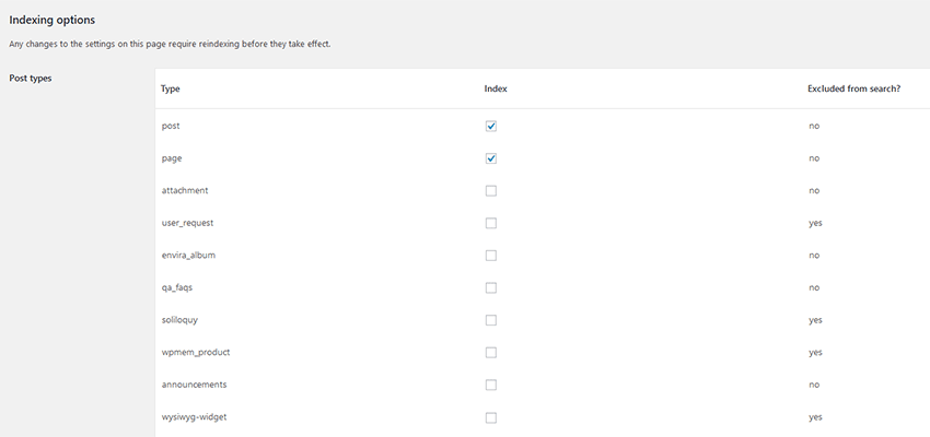
Ref. site:
https://speckyboy.com/wp-content/uploads/2018/09/content-heavy-usability-07.png
Concentrate on Security
One of the primary concerns that make people hesitant when it
comes to spending time on your website or purchasing something is the
security. To maintain the standard of WordPress website usability,
you must look out for security loopholes and take the corrective
measures as soon as possible.
Or else, your users will be in constant fear of losing over their
digital assets, if your website gets attacked by hackers frequently
or have serious downtime. In such a situation, your audience will
also have a tough time trusting your brand altogether.
Therefore, make sure that you’re cautious enough and taking
security issues quite seriously. By doing so, establishing brands
credibility becomes easier. And, improving usability seems an
achievable task.
Precise & Clear Call to Actions
Regardless of the niche your business is working in; you must put
adequate highlight over your CTA buttons so as to make them instantly
visible by your website visitors. Before displaying these buttons, be
clear in terms of where you wish to redirect your users, whether it’s
to a landing page or a specific product page.
For instance, let’s take this CTA and message and evaluate it:
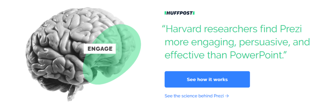
Ref. site:
https://devrix-devrix.netdna-ssl.com/wp-content/uploads/2018/11/Screenshot-Presentation-Software-Online-Presentation-Tools-Prezi.png
The CTA mentioned in the above picture encompasses clear language
and a precise message. The typography size is correct, and the tone
is convincing as well. The information has been placed in such a way
that it makes it easier for users to have an amazing visual
experience.
If your CTAs aren’t getting enough notice, figure out the basis
of the problem. Discover what exactly is making your visitors stay
away from your CTA buttons and fix that issue immediately.
Consistency is the Key
Consistency is another principle, rudimental enough, so as to be
respected well enough in the usability of a website. Whether you’re
developing the website for the first time or redesigning it
altogether, you must stay consistent in terms of interactions,
functions, performance, content, and task operations.
For example, have a look at The
New York Times page.

Ref. site:
https://devrix-devrix.netdna-ssl.com/wp-content/uploads/2018/11/Screenshot-Breaking-News-World-News-Multimedia.png
For years, they have stayed consistent. Despite minor changes in
their design, the users of the New York Times would still know where
to find the information and where to click. So, keep introducing new
things to your website design, but not at the cost of consistency.
Final Words
An important thing to keep in mind is that accessibility and
usability are two basic foundations of any website. As long as your
site can be accessed by every person, it will be easier to gain
conversions and higher revenue.
Thus, apart from these few things mentioned above, enhancing UX
design and optimizing the usability is an ongoing process. With each
trend getting introduced, you’d have to make sure that your website
is appropriate enough to match the basic standards of the industry.
Also, while executing these tasks, make sure you are keeping
end-users in mind. Create an objectified strategy and stick to the
plan. Dig deeper into the research and keep implementing new ideas
and techniques to enhance the usability of your website.
At the end, your efforts are surely going to yield better results.
Don’t forget to share with us your proven techniques in the
comments section.
