Picture may be worth a 1000 words but for that, you need to have those 1000 words. LOL.
This means words are really important when we consider the website design. You see, 95% of content on the internet is just text.
So, words are still the best and effective way to communicate on the internet. While designing a website, it is necessary that you check how does the content appears to a site visitor.
Basically, the typography of your website should be compatible with all the display devices and should be user-friendly. We have jotted down a few tips that can help you improve the typography while designing your website.
Let’s take a look at each of the tips…
1. Choose fonts that justify your website’s purpose
This might feel a little tricky to you. But every font conveys a different message. Let us take an example for this –
You want to make a website to sell wedding dresses.
The fonts that will look attractive will be – Pacifico, Caveat, Lobster, etc. You see the cursive lines are connected and thus they look beautiful when used for a website that sells wedding dresses.
If you use similar fonts for an agency website, that won’t work. The brain works there and not beauty. LOL.
So, pick a font that serves the purpose of your website.
2. Choose fonts that are responsive on all the devices
Most of the website owners make mistakes by considering mobile display as a second option. Last year, it was found that 58% of people use mobile phones to access websites. And so, it becomes necessary that your website is mobile-ready.
The font type of your content should be such that they are easily readable on mobile devices. This means that the fonts you select should be visible and clear in all the sizes i.e. small size as well as large size.
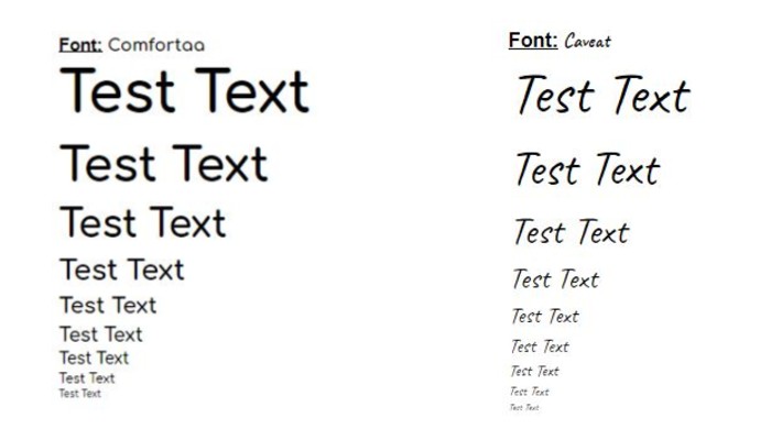
You see these texts in various sizes. The fonts of Comfortaa and Caveat are compared here and you can easily make out that Comfortaa are easy to read even when the text size is reduced.
This means this font is mobile-ready.
3. Avoid Using All The Letters in Caps
IMAGINE THAT WE ARE CAPITALIZING ALL THE TEXT IN OUR CONTENT. DOES IT LET YOU FOCUS ON EACH AND EVERY WORD? HOW DO YOU FIND THE LETTERS TO BE?
NO NO NO… WE ARE NOT SHOUTING AT YOU.
But, it doesn’t feel that way, right? Yes, using all the letters in caps on your website makes a visitor feel like you are shouting on them.
You might end up annoying visitors. Using caps does show confidence and commitment, but using it for the whole content makes the user feel like you are screaming.
4. Sufficient space between letters, words and sentences for better readability
If you get a blank space between the words and sentences doesn’t mean you need to utilize that space. The gap should be enough that it can be comfortably read by a visitor.
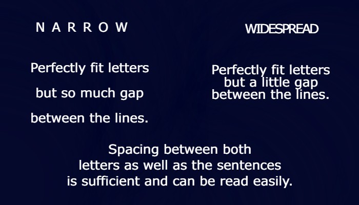
The letters shouldn’t feel narrow or widespread, sufficient and constant gap between the letters and the sentences looks good.
5. Avoid using RED / GREEN text or support it with a special character
Due to Deuteranopia, there might be a few people who won’t be able to distinguish between normal text and Red or Green colored text.
But there is always a way. If you want to use the Red or Green text, you should try to support it with a special character (@,#,$,%,*,&). Normally, an asterisk (*) is used before or after these colored texts.
6. Do not use more than 3 types of Font styles
“Oh my God! This is so confusing, I am finding this hard to read and can’t keep my eyes on just one style of font.”
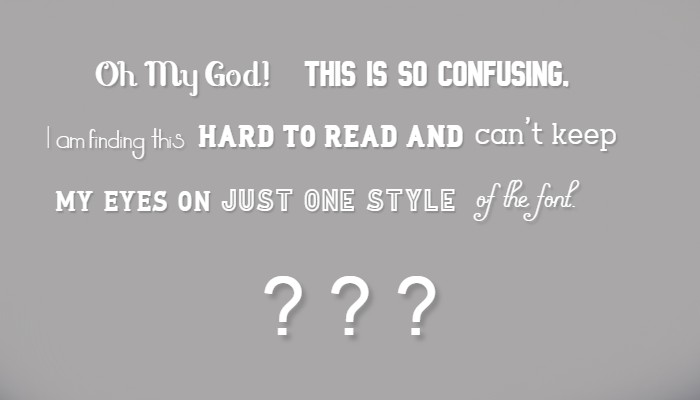
Yes, you can’t. This is what happens when you use different font styles on your website. Limit the use of font styles to two or maximum three styles but not more than that.
7. Decide the font based on the background image or video
You might not consider it important or sometimes would be ignoring this, but the background image or video on the web page gets covered by the text. You may think that it doesn’t matter, but it does.
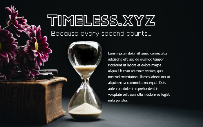
Take a look at the above two images – two different layouts of a website’s homepage. Which one do you think looks good visually?
Undoubtedly the second one. This is because the text doesn’t overlap the objects in the image. When your text appears over the objects, it creates a disturbance amongst the visitors and it doesn’t look visually attractive.
So, it is necessary that your fonts match the background as well as they don’t overlap the image or the video in the background.
8. Keep the Typography and the Background Contrasting
The background color of the website on which the text will appear and the text color should be kept contrasting i.e. Use the light-colored font with the dark-colored background and vice versa.
Lorem Ipsum Dolor Sit Amet – ( or ) – Lorem Ipsum Dolor Sit Amet
Which one do you find easier to read?
That’s right, the second one and that is because of the contrast in background and font colors. The contrasting colors make it easy for a visitor to read the content on your website.
For the first text “Lorem…”, a user has to struggle a lot to read the text and sometimes he or she might give up reading your content.
On the other hand, due to the letters easily visible to a visitor in “Lorem…”, there are more chances that a visitor will stay on your page and continue reading.
And therefore Contrast = Correct.
9. Keep the hierarchy of fonts
Yes, creating a visual hierarchy is a must. For instance, you keep all the font size the same for the title, classifications and the content, it would become hard for a visitor to figure out different sections.
So make sure you utilize the hierarchy technique. This means you should select the size and style of the fonts based on its functionality.
The title should be assigned a “Title” style.
Similarly, a heading of a topic should be assigned “Heading 1” or “Heading 2” and the rest of the content inside the paragraphs should be “Normal Text”.
Examples of some of the best web designs (Typographically)
Let us now look at some of the best website designs based on typography.
1. CRRTT
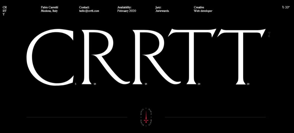
CRRTT is a website of a freelance website developer. This website has only a single type of font.
2. Vito Salvatore
This website has an image expanding in the background and the fonts remaining steady. The font style matches the background images used here.
3. Glyphy
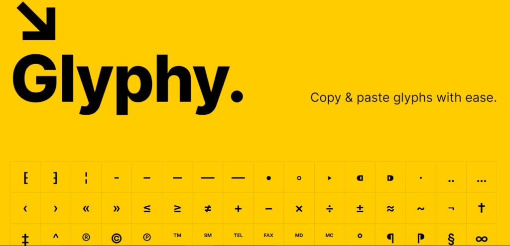
This is a website where you can copy and paste the symbols. It has just a single type of font and has only two colors, yellow in the background and black for text.
4. Myles Nguyen
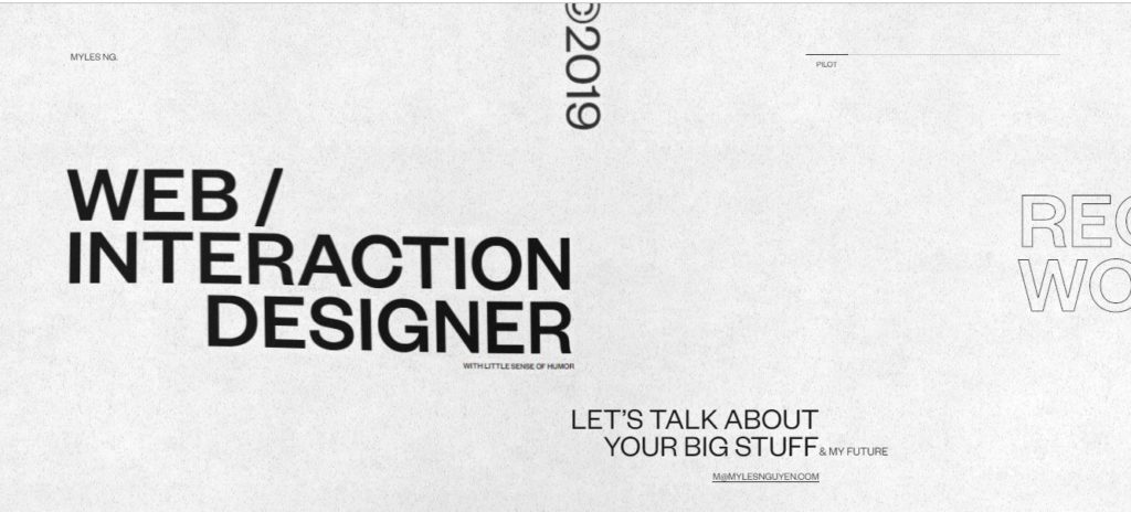
This is a website of an interactive website designer. The fonts on the website float and slide simply.
5. Paolo Fornasier
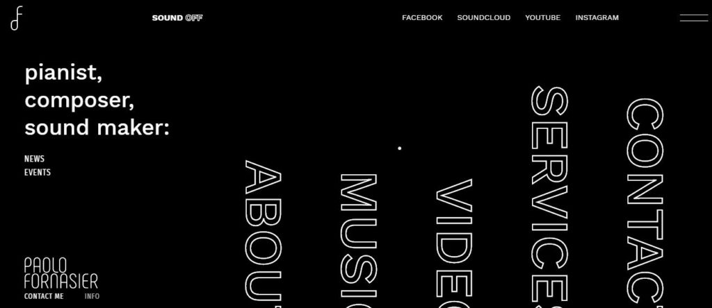
This is the website of a music artist. It contains three different font styles.
6. Flandria
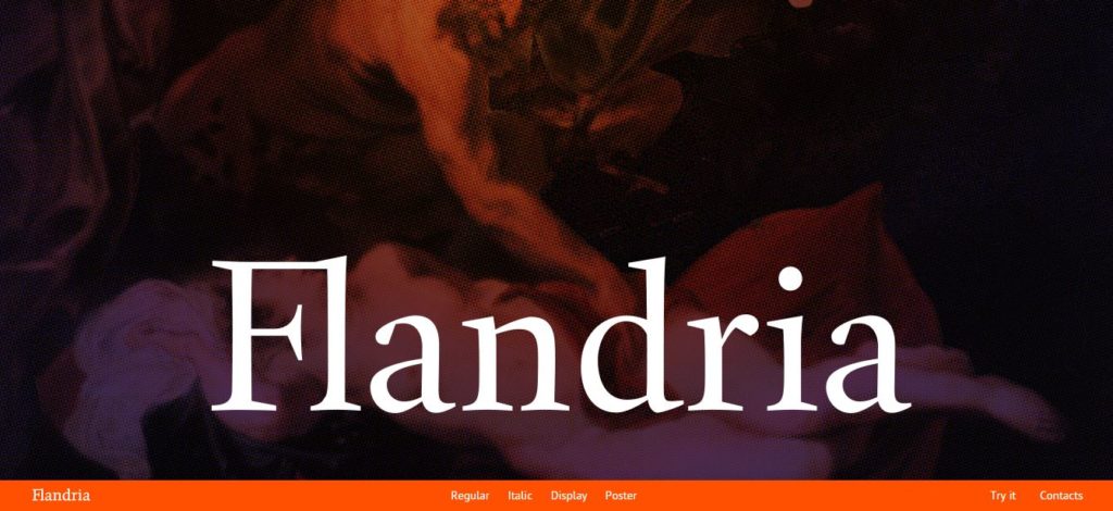
This is a website where you can read books on and it only has limited fonts that gives it a classic look.
Conclusion
The typography on your website matters a lot while designing a website. You don’t want to give your site visitors a bitter experience on your website and for that, the typography must be taken into account.
About the Author
I’m Chris Wagner, Head of Content @HostingPill. I regularly write
about Hosting Web Servers, and WordPress. I have more than 9 years of Industry
experience. Read my article on the best web hosting companies here.
