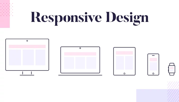
These days, more and more people are opting to access the internet via mobiles and other portable devices. For this reason, it’s become increasingly important to create and run a website that is responsive.
Responsive web design is all about building a website with flexible layouts and grids, images, media queries, etc.
But, when it comes to building mobile-friendly websites, getting this process right can be a bit confusing for beginners.
Luckily, you don’t have to be a seasoned web professional to master all the different areas of responsive web design and build your first mobile-friendly site. All you need is the right step-by-step guide – which is the focus of this article.
Read the rest of this guide to discover everything you need to know about responsive web design, including what it is, some examples of poor and great design, and tips on how to use it effectively.
What is Responsive Web Design?
In this digital world competition is very tough and surviving in the market is also very tough. You have a very small piece of time to fragment to attract your website. A good designed and optimized website gains more customer trust and helps to improve to gain more traffic to your site. in short, a web design is not a need but it’s a necessity now.”
Responsive web design is one that changes according to the device screen size. The term responsive is often used interchangeably with mobile-friendly. However, there are subtle differences between the two:
Responsive Design adapts to any screen size for both mobile and desktop devices. To learn more about the importance of responsive B2B web design, make sure to visit https://www.allianceinteractive.com/website-management-services/ and become familiar with it.
The website’s components change according to the device you are viewing it on, which might translate into things such as:
- Text and/or spacing changing in size
- Optimizing images
- Content layout adjusting to the screen
- A change in the menu format for improved visualization
In short, responsive websites are designed to react with the user in mind, which means that they are focused on enhancing usability regardless of the device being used.
Source
Mobile-Friendly Design, on the other hand, looks the same regardless of which device you use to access it. For the most part, this means having one website for desktop browsers and a separate one for mobile devices.
While your website may seem like one marketing channel, proper channel management requires that the mobile version and desktop alternatives as distinct channels. Different users seek different things from mobile vs. desktop browsers, and you must build your website to be optimized for users on all devices.
Examples of Responsive Web Design
Although web design trends are constantly changing, the principles of good web design have always remained the same.
Incorporating fundamental web design principles into your responsive design will ensure a cohesive user experience that is both visually engaging and functionally efficient.
These include things such as:
- A navigation that is easy to understand
- A good color scheme
- A clean layout
- Proper use of animation
- A visually appealing interface
Moreover, your design should be appropriate for the theme or topic of your site. Also, all the design elements you choose and the content you use should be kept well organized.
Below, we take a quick look at some examples of responsive web design to give you a better understanding of where it’s used well and where it’s used poorly.
Example #1: Dropbox
Good Web Design.
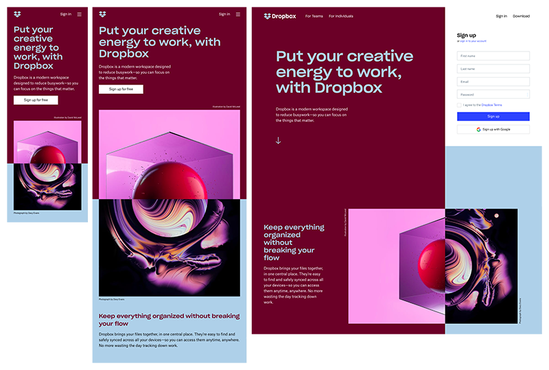
Here are the reasons why this website’s design is good:
- It uses a grid to keep all the products organized.
- There’s enough contrast to make products stand out.
- Uses lots of white space to make the page appear less cluttered.
- The text is highly readable.
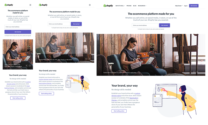
Example #2: Shopify
Good Web Design.
Source
Shopify is a great example of creative web design. The site provides a seamless and consistent user experience across all devices, with only the call to action buttons and illustrations changing between mobile and desktop devices. In handheld devices, the menu is replaced by a hamburger icon for improved visualization.
Example #3: LingsCars.com
Poor Web Design.

Source
The poor use of colors in this example is the reason why this website has a poor design. There are conflicting colors, and the text colors don’t make for good readability against the background color scheme. Furthermore, the navigation seems quite complicated, all of which makes for a poor overall user experience.
Example #4: Arngren.net
Poor Web Design

Source
Where do I start?
- The website doesn’t use a grid.
- It has a disorganized navigational structure.
- The typography is poor, making it unreadable.
- There’s random use of colors.
It would be hard enough trying to view this site on a desktop, but can you imagine someone navigating it on a mobile phone?
How to Use Responsive Web Design Effectively
Now that you know what responsive web design is, and you’ve seen some examples of this concept in use, let’s take a look at the best practices for using responsive web design effectively to increase traffic, generate more leads, boost conversions, and transform more of your buyers into brand ambassadors.
1. Responsive vs. Fluid Layouts
Your first step toward mastering responsive web design is to choose whether you’ll use responsive or fluid layouts.
When talking about mobile-first design, people tend to use “responsive design” and “fluid design” interchangeably. However, these two are quite different.
Responsive design makes use of fixed units of pixels in order to define the breakpoints where the user interface (UI) content adapts to scale either upwards or downwards.
Fluid design uses percentages to automatically resize content to fit the screen you’re viewing it with. Although this sounds handy, it’s important to err on the side of caution when using fluid design because the end result might look strange depending on the size of the browser or device.
For instance, if the screen is too small, the content may appear cluttered and difficult to read. On the other hand, if the screen is too large, certain elements may become stretched or distorted.
This is one of the main reasons why choosing responsive design over fluid design might be a better option for beginners designing for different screens.
When deciding whether to go with a fluid or responsive web design, you should take a look at the functionality and features of various web design tools. To help you decide which tool is best for your web design needs, you can take a look at my guide to the best web design tools.
2. Use Three Breakpoints (at the very least)
Breakpoints are points in a website’s CSS that alter the way content appears on various screen resolutions.
They are typically designed to use min- and max-width values in responsive design. These are the minimum and maximum width of pixels for each element or across an entire screen.
The majority of responsive websites need at least three breakpoints in order to work properly. If you take a responsively designed site and resize it within your browser, you’ll notice that the content will adjust accordingly depending on the size you scale it to.
The breakpoints are typically broken down to mobiles, tablets, and desktop views, but you can have more in order to cover all the bases for even more device flexibility.
And while on the subject of using breakpoints, a good rule of thumb is to start with min-width breakpoints.
As previously mentioned, there will be a minimum and maximum width for the breakpoints you use in your responsive web design.
If using the mobile-first approach (which is recommended), start designing from each minimum width of the 3 breakpoints. This way, you’ll be able to design the screen for smaller devices and then add more UI elements and content as the screen size grows. Keep in mind that it’s always easier to scale upward than downward.
3. Make Content Your Priority
The best responsive designs focus on content. Assuming you are using the mobile-first approach, you need to prioritize important content for your mobile devices and then include more content for larger screens.
Mobile users prefer shorter and simpler interactions, which means they are often looking for content that is more specific. One way to help create a seamless user experience on mobile is to hide content and only reveal it whenever necessary.
If the content absolutely has to be on the page, you might consider using collapsible and expandable menus to ensure that you include all relevant content without making your page too cluttered.
4. Use Responsive and Optimized Images
Whether using fluid or responsive web design, it is essential to include high quality images, memes, inforgraphics and other interactive content using graphic design tools.
Whether using fluid or responsive web design, it is essential to include high quality images, memes, inforgraphics and other interactive content using graphic design tools such as logo creator app, flyer creator app, poster creator app and many more.
These pieces of content offer a break from the text while offering a change to engage, inform, or humor your readers in a way that would be simply impossible with text alone.
Different devices have different numbers of pixels per inch. This can result in images that are blurry if they aren’t ordered at the right resolution.
So, depending on the device’s resolution, some images may be required at double, triple, or even quadruple the size (@2x, @3x, or @4x).
Web browsers these days support the <picture> element, and this selects the proper image resolution according to the device in use. As a designer creating a responsive website, you can tailor the images to the right device by exporting at all the different resolutions that are used on modern devices.
5. Design for Thumbs
Users interact with desktops via clicks, but on mobile, they use taps and swipes. Also, they use desktops on the surface whereas the mobile devices are held in their hands. This means you must consider these differences when building responsive websites and design important UI elements like tap targets with this in mind.
Remember, the main goal of responsive web design is to create a seamless user experience, so designing for thumbs will help enhance the elements that your users interact with.
Thumbs can easily reach the center of the mobile device screen, but it’s harder to tap the corners or sides of the screen.
Here are some tips to ensure users can tap the screen with ease:
- People typically expect to see the main desktop navigation of a website at the top of the page, whereas, on a mobile, it should be on the bottom for easier access.
- Keep other interactive elements in the center of the screen to make it easier for thumbs to reach them comfortably.
- CTAs and important links should have a height of 44px (at the very least) since smaller tap targets can be bad for usability.
Conclusion
There are, of course, other elements (like button design, typography, etc.) that you must consider in responsive web design.
However, this guide has enough information to help you get started toward a path to building exceptional responsive websites that will create a seamless user experience across all devices and platforms.
