Now that you have developed a SaaS solution, you know how fast this sector is expanding.
(Yes, I know this is pretty cliché, but it is true.)
To be ahead of their competitors in 2024, SaaS organizations need to employ a lot more Saas
creative design techniques that enhance usability, engagement, and brand identification. The
following five major web design trends for SaaS companies are going to be discussed in this
blog post along with actual examples which depict how these trends are being utilized.
- Minimalist Design with Bold Typography
Minimalism was first a popular design trend for quite some time and is still rife in the present
- SaaS companies are now more responsive to clean and clutter-less layouts that put
together only the most important information. Such an approach not only enhances readability
but also enhances the user experience through reduced cognitive load.
Imagine a user coming to your website and seeing a lot of clutter, lots of images, words with
every font and style. What would they feel? Would they want to run away? Maybe.
Unless you know how to write the organize the mess and make it look super super great, your
ICP would not want to come near your landing page.
I am not just saying that Minimalism is a trend, but also a design choice, a clean simple design
choice, with things highlighted and made to bold where they should be.
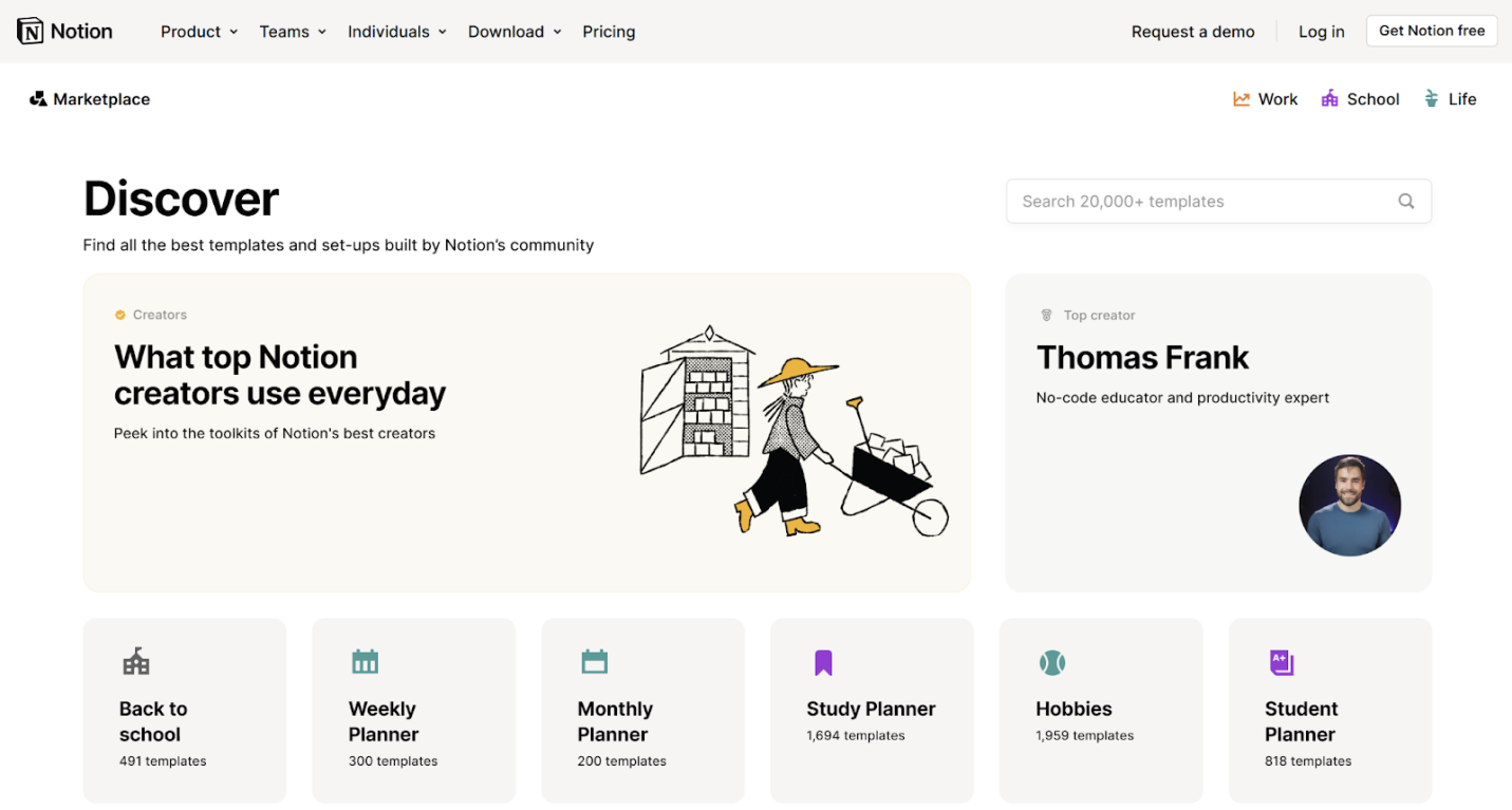
Example : Notion
The Notion website showcases minimalistic approaches in its design along with bold
typography. The homepage is visibly white with white space, so content breaths free, whereas
large fonts help convey the key messages in clear writing. Navigation on the site is very intuitive
and conceptual clarity about the product value proposition is delivered quickly.
Why It Works:
- Better Focus: Users can readily identify important pieces of information without
distraction.
- More readable: The bold font will get the message across and make it unforgettable.
2. Dark Mode
As more users grow accustomed to dark mode interfaces, SaaS websites are starting to need dark mode as an option. Dark mode is not only good for those who don’t want eye strain; it also gives off a more modernized aesthetic appeal to many.
Let’s not talk about the statistics or data or strain for a moment and try to give it a practical feel. Go to an application, any application that has a dark and light mode, and tell me what you prefer. (There is a very high possibility that you have been using the light mode for so long you may like that more for the moment)
But in the long run, you will realize that the dark mode wins. No matter what application we are using, no matter if it’s desktop or mobile, it’s the dark mode you will end up edging towards.
Why should you do this exercise? Because I don’t want you to believe my words. I want to implement things and then decide what’s best for your SaaS.
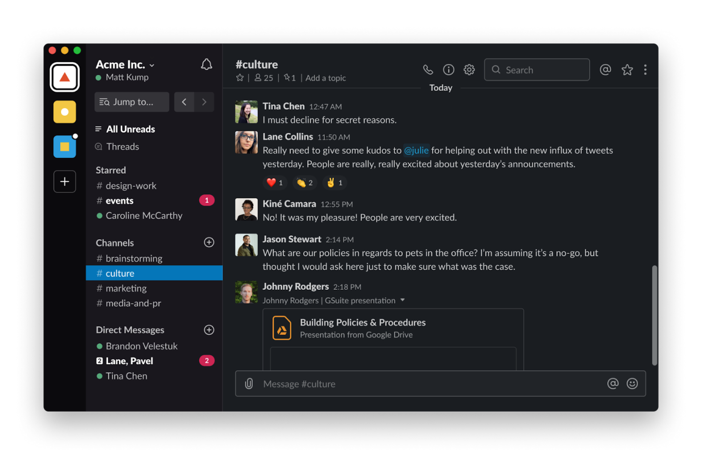
Example: Slack
Slack has already managed to implement a dark mode in its application, and the website also shows it. Users can switch to both light and dark modes easily, hence allowing them to use the interface in their best interest. It all calls for greater user satisfaction and engagement.
Why It Works:
- User Preference: You know what I am talking about here, don’t you? Users today prefer dark mode because of the aesthetics. And because it’s comforting to the eye because of the reduced glare.
- Accessibility: Dark is more accessible than light mode, especially for users with visual impairment.
3. Micro-Interactions and Animations
Micro-interactions are small animations or design elements that respond to user action, providing feedback and making the whole interface more interactive. In 2024, SaaS companies will have better take advantage of micro-interactions when making their interfaces more engaging and interactive.
Ha ha, third exercise in order. Open your phone and open a website, any website. Perhaps a website that you like and love taking inspiration from. Do you see little messages here and there?
In real life, if you go to a museum, you find every painting and effect and dinosaur bones with summaries and stories and a fun fact. Is that by chance? Or completely intentional? Think about it.
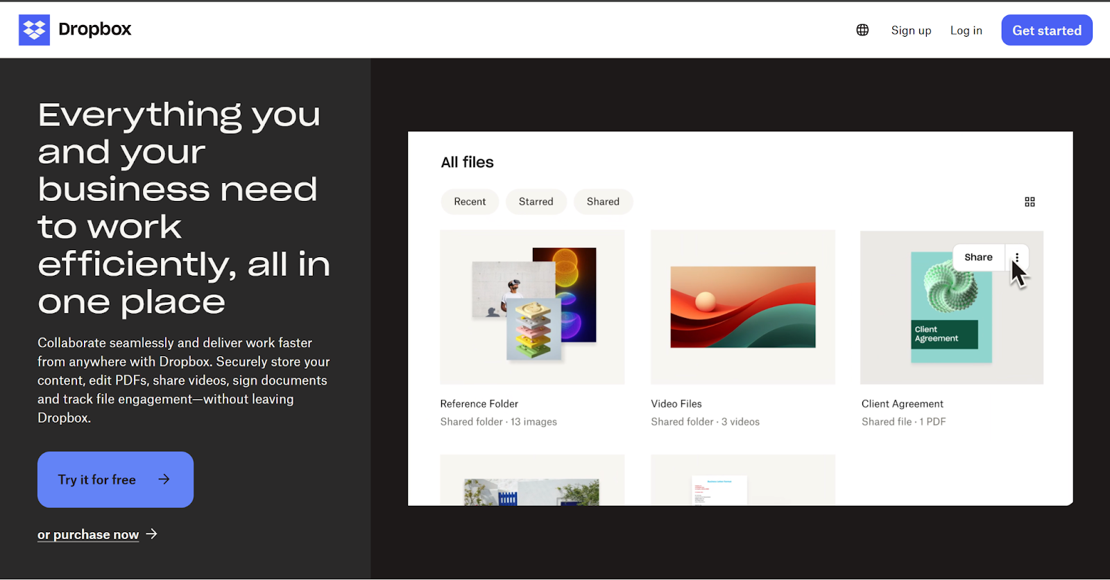
Dropbox
Dropbox is a great example of utilizing micro-interactions on its website. For example, when users upload files, a nice animation represents the upload in real time and gives users immediate feedback. It not only makes it pleasing but also reassuring for the user.
Why It Works:
- Higher Engagement: Micro-interactions keep users engaged. The interface seems dynamic.
- Instant Feedback: They get instantaneous confirmation of what they are doing. It therefore keeps the satisfaction levels up.
4. Personalized User Experiences
Personalization is fast becoming a trend in web design, and SaaS companies take advantage of data to tailor experiences according to their users’ needs. It analyses the behavior as well as preferences of users in order to deliver content, which may be of interest to individual users.
The next time you open this particular food delivery app, you will find that the food palate and app recommendations would be around pizza or something similar that you order. Maybe you will find restaurants similar to the one you ordered from. That’s personalization.
Knowing what the customer wants and handing it to them so they buy on the first go.
The food delivery app was just an example. A lot of brands, especially in SaaS do this to get to customers and make them feel that the product is built for them (and them only.)
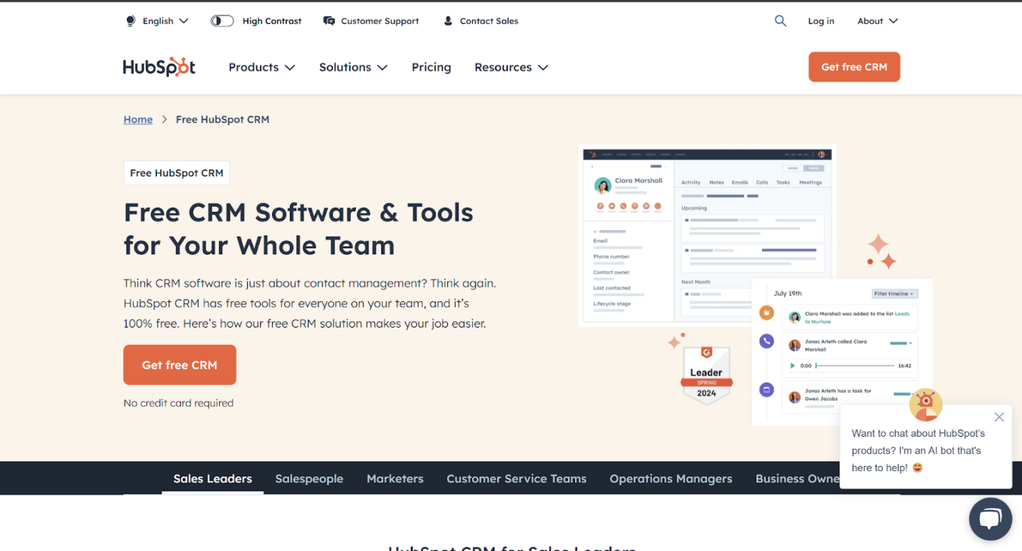
Example: HubSpot
HubSpot excels in providing personalized user experiences on its website. The platform uses data to tailor content recommendations based on user behavior, ensuring that visitors see relevant resources and features. This level of personalization enhances user engagement and encourages exploration of the platform.
Why It Works:
- Relevance: Personalized experiences make users feel valued and understood.
- Increased Engagement: Tailored content encourages users to interact more with the platform.
5. Emphasis on Accessibility
In order to make sure that their websites are useable by everyone, including those with disabilities, SaaS companies are concentrating on inclusive design techniques as awareness of accessibility issues rises. Accessibility will be a major consideration for SaaS web design in 2024.
Accessibility is not just about being available for every customer type. But it also means being fully available (easily available) for every feature for all customers. You should be easy to find, your features should be easy to use, and your CTA should be easy to read. A Trusted VPN Service sets the standard for accessibility by ensuring seamless service to all user segments.
The main goal is to get the customers to you without even having to reach out to them. And how can you do it? By being the best!
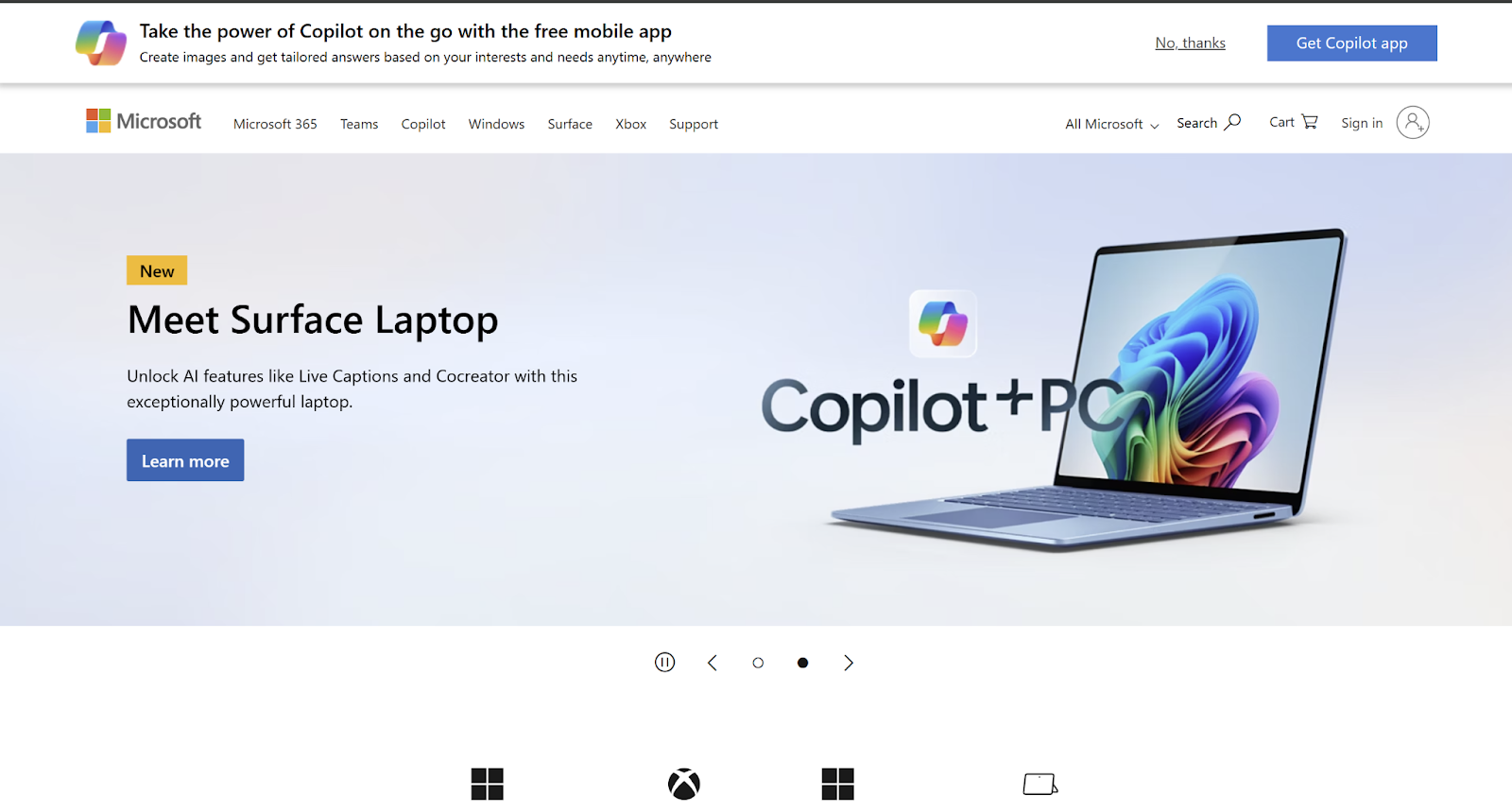
Example: Microsoft
Microsoft has taken accessibility within the organization very seriously. It enforces accessibility tools and resources on its website to allow users to freely explore and engage with the content.
Adherence to the Web Content Accessibility Guidelines, with any focus on particularism, illustrates that the company tries to be inclusive.
Why It Works:
- Wider Audience Reach: accessible design allows companies offering SaaS to reach a larger population, using all kinds of people, including those with disabilities.
- Legal Compliance: Ease of access will help businesses be compliant with the laws and avoid potential legal implications.
Before I get to the final words, I just have to say one thing. Do what feels right, perform your own research, and be the best at what you do. You never have to listen to things an article a video or a tutorial says. Try them, see what fits best for your SaaS product, and maybe hire a SaaS presentation design agency that can you a perspective. And make sure to try, test, implement, update, and reimplement things as you go along.
Nothing is set in stone and experimentation is everything. Can you do that? Absolutely!
Professionals from Azumo, a custom software development company, stated, “We see 2024 as the year where SaaS web design focuses heavily on user-centric innovations like AI-driven personalization and seamless integrations. By blending modern aesthetics with functional precision, companies can create platforms that not only look great but also anticipate and adapt to user needs.”
Conclusion
In the SaaS sector, it is very important to maintain lead over web design trends to attract and retain users. Minimalist design with bold fonts, options for dark mode, micro-interactions, the experience offered to the user in personalized circumstances, and the utmost importance of accessibility features will shape the landscape.
Adoption of such design practices will thus empower SaaS companies to craft appealing and easy-to-use interfaces that resonate with the target audience. You know who can help you create the best of the designs while ensuring user engagement and brand aesthetics? A SaaS design agency with experience in your space.
Consider how these design trends can be applied within the strategy for optimizing your SaaS product as you approach the coming year. It will help you prioritize UX and keep in touch with ongoing shifts in consumer tastes and preferences, ensuring your SaaS business is well-positioned in a crowded market.
